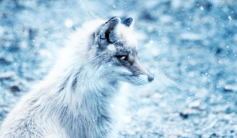
23 Jan Blue Foxes: The Most Popular Rare Animal in Marketing
If you’ve never searched “blue fox marketing” on the internet, you’re in for a treat… especially if you’re a branding and design nerd. Try it out. Go on. Dozens of companies are registered under a variant of the Blue Fox name. However, blue foxes seem especially popular in the marketing industry. What is it about the Arctic fox, particularly its blue morph, that appeals specifically to marketing companies?
An Arctic fox, typically white in winter and brown in summer, is born “blue” only about 1% of the time. The coat of this elusive creature appears dark blue or gray, year-round. They stand out among the wintry white of the northern landscape. From a competitive standpoint, it symbolizes rarity. You want to stand out from the crowd. You want to be that 1% that looks and even acts differently. Let’s take a look at how some of these blue fox marketing companies represent themselves with their logos! (Since we don’t have permission to use their logos, simply click on the company name to see each one’s logo on their website.)
Blue Fox, LLC (Fort Mitchell, KY)
Will Lester named his company after the fox’s uncanny abilities to “locate and plot a precise trajectory to pounce on unsuspecting prey buried deep out of sight in the snow.” This market research firm promises to uncover analytics solutions in the mountainous drifts of data snow. A swirling yet mathematical line forms the logo’s fox carefully trotting through the snow. It posture gives an air of pride, elegance, creativity, and exactness. The logo’s dark ocean blue and white juxtapose the warmth of the ocean and the coldness of white snow. The simple and minimal image works with the company’s mission and brand.
Blue Fox Media (Chico, CA)
With its icy blue colors, Blue Fox Media brings the cold. It’s certainly bright and energetic! The sleek S-shape design almost makes you wonder why the company’s name doesn’t start with an S instead. However, the shape indicates an attentive and patient fox waiting to strike. The cool logo captures the spirit of the young staff and company services revolving around social media marketing. Their area of expertise requires attention and patience.
Blue Fox Marketing Consultancy (Alresford, UK)
You might think you’re wearing cyan-covered glasses when you go to the Hampshire-based Blue Fox Marketing Consultancy’s website. The blue box with the white fox in it is an interesting choice, especially since it’s not leading you inwards. Rather, it’s looking outwards, creating an aloofness and a cold shoulder to the company’s own logo. Maybe it’s concentrating too hard on listening for its next meal. BFMC says they listen intently to their clients to create the right plan of attack. Sounds foxy to me! Though foxes roam London openly, the fox fits in with their rural setting.
Blue Fox Marketing and Blue Fox Partners (Los Altos, CA)
The Blue Fox Partners logo is piercing, mysterious, sleek, crystalline, and noticeably cute. It serves as both sophisticated and modern while being determined and soulful. The fox looks straight into your eyes accompanied by a simple, smooth typeface.
Blue Fox Partners’s sub-brand, Blue Fox Marketing, uses a more childlike take on the fox. The logo’s image looks almost hand-drawn. The fox is caught between playful and predatory. The typeface is bold and blocky, not very fox-like attributes.
Blue Fox Digital Marketing (London, UK)
This London-based Blue Fox agency’s logo is a pixelated, pointy crystalline icy fox. Its curves are natural and layered like a pinecone or artichoke. It’s futuristic and modern while natural and classic. It’s unique, dynamic and noble. It represents their forward-thinking strategies and “organic” foundations.
Blue Fox Creative (Chadds Ford, PA)
This is one mean-looking fox. The addition of the tail to underline the logo is a strange choice because it lacks a body. It comes off sort of Cheshire cat-like. With the words outlined twice, the logo becomes harsh, blocky and bit more like you might expect from a car dealership. Maybe the fox is meant to scare away competitors? Maybe it’s the fighting spirit!
BlueFox Media (Phoenix, AZ)
Phoenix’s BlueFox Media created a logo for their company that stands out among the crowd in its simplicity but ingenuity, incorporating the fox tail into the first letter. The pure blue and charcoal stand together in delightful pairing of soft, rounded typeface. As a whole, it creates a sleek and elegant logo. It reflects the company’s dedication to adaptability and strength in knowing what their clients need and want. Like the fox, they’re intelligent in that regard. Hopefully, they cook up better meals than raw rats, though.
BlueFox.io (Sunnyvale, CA and Paris, France)
Somewhat similar to Fort Mitchell’s Blue Fox, this BlueFox’s fox is active and graceful. In a fun twist, the logo starts out in a white outline at the top of the website, and shifts to shades of blue when you scroll down. It’s subtle but brilliant. BlueFox.io provides systems for real-time traffic data analysis. They’re on top of the marketing data game like a fox is on top of the hunting game. The active, walking fox is no coincidence in the company’s design, as it’s what the company’s service revolves around: foot traffic.
All the logos have a common thread: the color scheme of blue, white, and black or gray. If you’re branding or rebranding your own company, view these as a lesson in just how many variations one can take on a common theme. You can go in countless directions with your company name and logo.
Meanwhile, maybe the next potential Blue Fox marketing company should reconsider naming themselves leopard fox to really stand out!


No Comments