31 Jul 2019 Color and Design Trends Revisited
Pantone declared the 2019 color of the year to be living coral. And, looking back, the quirky color and its warm toned friends have certainly made their way into our collective consciousness. Fashion, art, design, and new products have all featured this 2019’s color of the year.
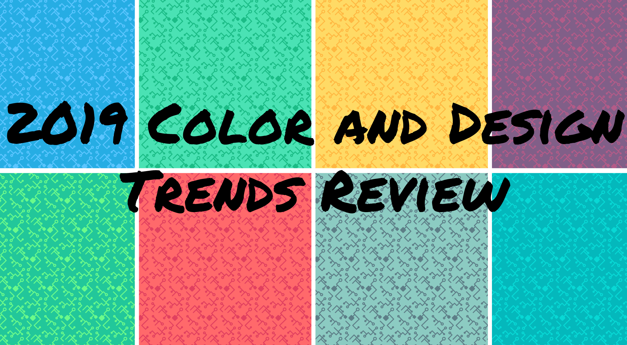
But, it isn’t just living color that has made an impression. This year has seen a marked increase in dramatic color combinations. Bold color combinations have been all the rage in graphics for the better part of a year. Designers are taking an opportunity to push the limits and bring together colors, graphics, and fonts that would have been considered clashing in previous years to create eye-catching new results.
What does this bold, open design environment mean for brands?
Now might be the right time to take risk and experiment with your brand design language. Think new colors, new fonts, new channels. The possibilities are there, your customers and prospects are open to seeing something new, and designers are likely tired of being trapped inside the traditional lines. Try using some new funky fonts in your social images. Using more than one is not only acceptable but provides greater impact and attention-grabbing effect. Using contrasting colors brings even more to the creativity party. Help your brand stand out with eye-catching, modern designs.
Don’t let the experimentation stop with your social media profiles. Consider how to use these bold new designs at events with inclusion on new swag like drinkware, bags, or clothing. Another great opportunity is just around the corner with the start of the new school year. Parents and students will be excited for the growing trends of bold text and contrasting colors. The more engaging your design, the more they will reach for your products and extend your brand.


No Comments