05 Jul Choosing Visuals for Your Annual Report
For many nonprofits, it’s annual report time! Numbers matter but remember to feature what really connects donors to your cause: meaningful visuals. According to Network for Good, readers process visuals 60,000 times faster than text–trigger powerful emotions, grab readers’ attention and help donors understand their impact.
By designing your report around charts, graphs, illustrations, and icons, you’ll improve the likelihood of engagement and comprehension. Whether viewers explore cover-to-cover or just scan through, they’ll get more out of the experience.
What Kind of Visuals Should You Include?
So how do you decide what kinds of visuals will tell your story best? First, determine who your audience is, and what your report needs to accomplish. Choose the right type of visual for the job.
Photography
If your donors are mainly investing in people, photographs of people connect best. Photos of real people engaged in your services deliver a powerful message. However, some kinds of nonprofits–take social services, for example–may not be permitted to show photos of their actual clients. You can get creative with how you frame photos in order to protect identities. Another option is to use stock photos, but these often appear fake. You don’t want to come off as disingenuous.
Speaking of real versus fake, a real-life setting looks better than a studio. Choose outdoor settings when possible. Your photos don’t have to look like they were shot by a professional artist. Aim for quality, but know that amateur photos can make you feel more approachable and open.
Graphs and Charts
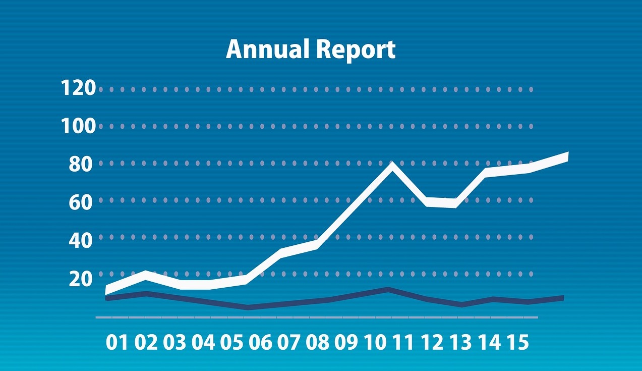
Many readers gravitate toward narrative. Others, especially donors and board members, may want to see facts and figures. Display quantitative data in a fun and attractive way. People can understand numbers more readily when you put them into formats that allow easy comparison. Charts can “wow” people with areas of growth. Combine individual charts or graphs with other types of visuals to build engaging infographics that tell a story all their own.
Illustration
If your visual goal is to highlight more abstract concepts in the report, illustration can help. An illustrative theme can be adapted to each part of the report, tying together your various messages. When you deal with things that can’t be seen–say the shrinking of a tumor by a newly developed treatment–you have to rely on illustrations. Work with a capable artist who can accurately capture your message.
A good graphic designer can blend photography, graphs, and illustrations in the right combinations. Just make sure you have a clear reason for using each one so as not to overwhelm your reader. Using sound design principles, particularly those related to color, focal point, balance, font use and negative space can ensure your piece doesn’t look cluttered or chaotic when you mix visual elements.
Online Reports
You might want to consider an online report, or a “living annual report,” that updates weekly and allows visitors to interact with the data and ask questions about what they see. You can share your latest information while cutting the time and cost of producing a printed piece.
Many organizations have cut back on paper copies or supplement their print material with online resources. Others have gone completely paper-free, such as this example Fast Company provides. Warby Parker, a New York-based startup, released their annual report as an infographic. Others opt for video. If you take this approach, consider a “mini-report” or print-on-demand option.
For an online report, consider including:
- Interviews and transcripts
- Videos
- Podcasts
- Photo galleries
- PDFs (with links embedded)
- Screenshots or links to presentations (Prezi, PowerPoint, e-zines)
- Animated graphic segments to share your numbers and financials
Your nonprofit annual report lets supporters know that their money, time, and support are making a difference. All the numbers and words in the world won’t create that strong emotional impact on their own, but coupled with compelling visuals, your message’s impact will increase exponentially.
IMAGE: Pixabay / CC0 Public Domain


No Comments