26 Sep 5 Famous Logos and Their Creations
1. I LOVE NY
The I Love New York logo stands as an emblem for the state of New York and can be seen on almost any street corner of its city.
In 1977, the logo was created to help build New York back up at a time when crime was at an all-time high and tourism at an all-time low. Milton Glaser, graphic designer and creator of the I Love New York logo. His inspiration stemmed from the Montreal campaign- “Montreal, the city with a heart.” Glasers’ original sketch was shown to the Department for Economic Development on a crumbled piece of paper pulled from his pocket, originally doodled in the backseat of a cab.
Glaser is applauded for doing the work solely pro bono, with the goal of helping New York City rise again. His original sketches are now displayed at the Museum of Modern Art in New York City. The design has evolved and been altered to the stacked characters that is seen today with an American Typewriter typeface.
2. APPLE
The signature apple logo is seen in the hands of almost any citizen, tech-savvy or not, standing for innovation.
An original design by founder himself Steve Jobs, but was later removed. Jobs hired Rob Janoff, an art director, to focus solely on the apple itself. Jobs’ only direction regarding the Apple was “don’t make it cute.” Janoff fulfilled Jobs expectations and delivered the iconic Apple we see everywhere today with its first version known as the “rainbow Apple.”
Janoff presented two options, one with a bite in the Apple and one without. Jobs selected the Apple with more personality. According to Janoff, the bite identified the design as an apple and not a tomato. Additionally, bite leads on to the play on word “byte.” Rather fitting for a tech company!
As Apple, continued to change and innovate, so did their logo to a more modern Apple that we seen on the back of iPhones and iPads and MacBooks today. The switch to a monochrome logo allowed for greater flexibility when branding its products.
3. FORD
For the past 100 years, Ford stands as one of the largest automobile manufacturers in the world.
The original Ford logo was designed by C. Harold Will. Ford’s oval shaped logo, also known as Centennial Blue Oval, highlights their cars’ reliability and economy.
From the time of its creation over a century ago, the font of the logo has remained consistent. Originally coming out in dark blue, the logo symbolized speed, lightweight, stability, and grace.
A deep royal blue background and oval background quickly became the company’s trademark, seen on the front of the thousands of Ford vehicles.
4. COCA-COLA
A rich history lies behind one of the most recognizable pops brands, Coca-Cola. After perfecting the final recipe for his soft drink, John Pemberton looked to come with a design. The 1800’s were a time for the “do it yourselfers” so Pemberton looked no further than his bookkeeper, Frank Mason Robinson.
Robinson came up with the name and sketched the logo’s distinctive typeface, Spencerian script, a widely popular writing style in the U.S. at the time. To put it simply, Robinson believed that “two C’s would look well in advertising.” It seems that Robinson’s penmanship skills paid off in the form of a widely famous logo.
Over the years, the logo has altered, changed, and added additions such as its trademark, a red box, a white underlining wave, bubbles, and now even your name! However, there is no mistaking the look and feel of its brand throughout its modifications. Robinson’s’ classic feel is here to stay.
5. NIKE
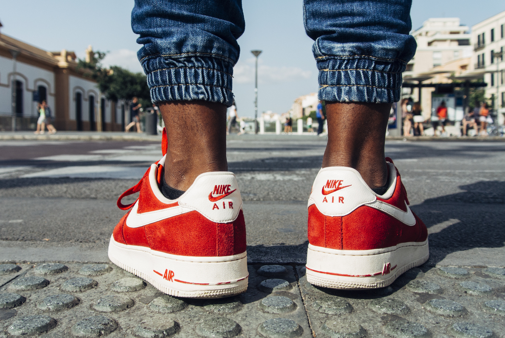
We all recognize the famous Nike “swoosh” on anything from running shoes and headbands to jerseys and athletic gear of high-profile athletes.
This iconic Nike Swoosh was surprisingly selected half-heartedly in 1971 by Nike’s founder, Mr. Knight. “Well, I don’t love it, but maybe it will grow on me.” I think we can all agree Ms. Davidson’s swoosh did quite a bit of growing.
Carolyn Davidson, a design student at Portland State was persistent on the Nike logo being simple, and portraying the feel of movement, energy, and speed. And thus came along the “Swoosh!”
The logo is said to claimed to also symbolize the wing of the Greek Goddess of Victory, Nike. In its history, the logo incorporated the Nike name alongside the swoosh. The solid black swoosh has become so iconic that it now stands on its own, maintaining its recognition by all.
Photo credit: Raúl González / CC 2.0


No Comments