05 Jul 6 Design Tips to Make Everyone Notice Your Apparel
It is a special opportunity to be able to design a piece of clothing. If you go to a crowded, festive, casual event like an amusement park, a concert or a local festival, look around at all the t-shirts, someone designed all those. But if you asked each person wearing them, you’re not likely to find anyone who can proudly claim that they designed it themselves.
Now that the possibility exists to create your own designs, you may decide to create your own clothing item. If you do, you want them to be good, right? If you want it to appeal and get noticed, there are some strategies to help make sure that happens. Graphic designers have training and experience to help ensure that designs look good. If design is not in your wheelhouse, or just not part of your everyday work, it might be helpful to review these six tips to help make sure your design gets the attention you want.
1. Clean, crisp & clear
It is cool to add grunge textures and similar effects throughout a design, but make sure that your message is easy to understand and readable in a short amount of time. Keep those textures as the low-contrast texture and make sure to clearly separate the main design elements. If you have a headline or a large logo on your site, make sure it stands out from the other detail. If it gets lost in the clutter of the background, you aren’t helping your design to communicate. It won’t attract attention.
2. Design to communicate
Make your main message the main thing in your design. Use scale and make that main element significantly larger than the other elements. In point number one, we mentioned contrast. If you are using more than one color, make sure the main point is captured with the ink that is a high contrast from the material you’re printing on. You may have also heard the term white space. Use spacing and margin to help guide the way the design is seen by the eyes of your viewers. The enemy is visual clutter. Help keep your main message, the main thing in your design.
3. Be funny
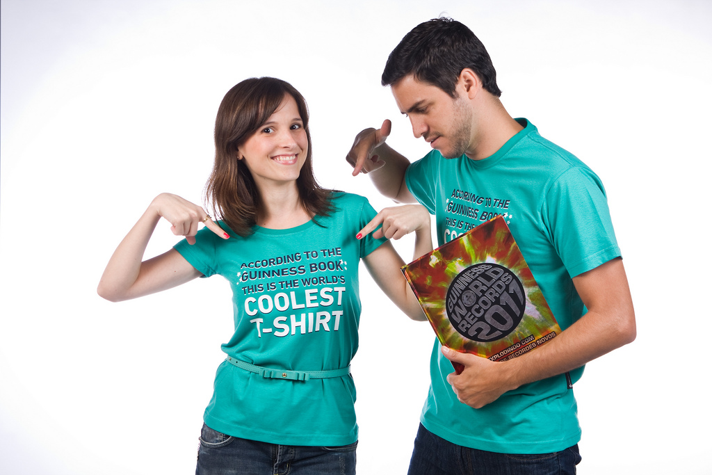
Humor is a great way to get people to notice your piece. If someone figures out your joke and thinks it funny enough to tap their friend’s shoulder and point. You’ve just doubled your audience! It also makes the shirt memorable.
4. Bold images
Not all masterpieces are good for apparel designs. For instance, The Garden of Earthly Delights, by Hieronymus Bosch is an amazing masterpiece, but it would not be well suited to a t-shirt design. There is simply too much small detail. Look to the masters. There is a designer named Saul Bass, who designed many of the 20th century’s most effective movie posters. His designs are perfect examples of extremely bold images that communicate very clearly.
5. Pop-culture references
People love pop-culture! If something makes you feel nostalgic for a time in the past, you have an extra emotional hook to attract their attention. “Oh, I remember that song from classic Sesame Street!” or “Wow, that’s the old logo for that company right? I didn’t realize how much it had changed.” But you do have to be careful you don’t infringe on copyright protected images. You can always create a respectful homage to a concept by steering clear of the actual artwork. There are countless cool alternate designs of Star Wars posters that are only a tribute to the places depicted in the films. Before you just take a hip cultural reference and slap it into your designs, make sure you read about copyright laws and the rules of fair use in fan art.
6. Inspire curiosity
Breaking rules has been mentioned. If you can create a visual scandal or a mystery in a design that encourages viewers to explore more deeply, you have won their attention fair-and-square. There is a popular brand of outdoors clothing with a highly-recognizable trademark logo that sits on the wearer’s shoulder. There is also a clever play on that logo that has gotten attention and many giggles. If you design and write a large block of text that in the first few lines establishes the fact that the content is funny and worth exploring, even if it isn’t large or bold, you’ll have people following you around asking you to hold still while they finish reading, looking for the punchline.
Don’t forget, these are only six of many considerations. Once you fully understand a rule, you can also break them to great effect. There are many other sites like this one, that provide other guidelines on typography and layout.
Never stop learning! Next time you see a well-designed t-shirt, hat or other graphic, stop and ask yourself what it is about it that caught your eye. What is it that appeals to you? It is not plagiarism to learn from others. No designs are completely original concepts. Everybody who creates a design is playing off hundreds and thousands of effective images in their memory. Any new design is really just trying to do the same thing over and over, only each time it has to look different!


No Comments